Hungarian National Theatre
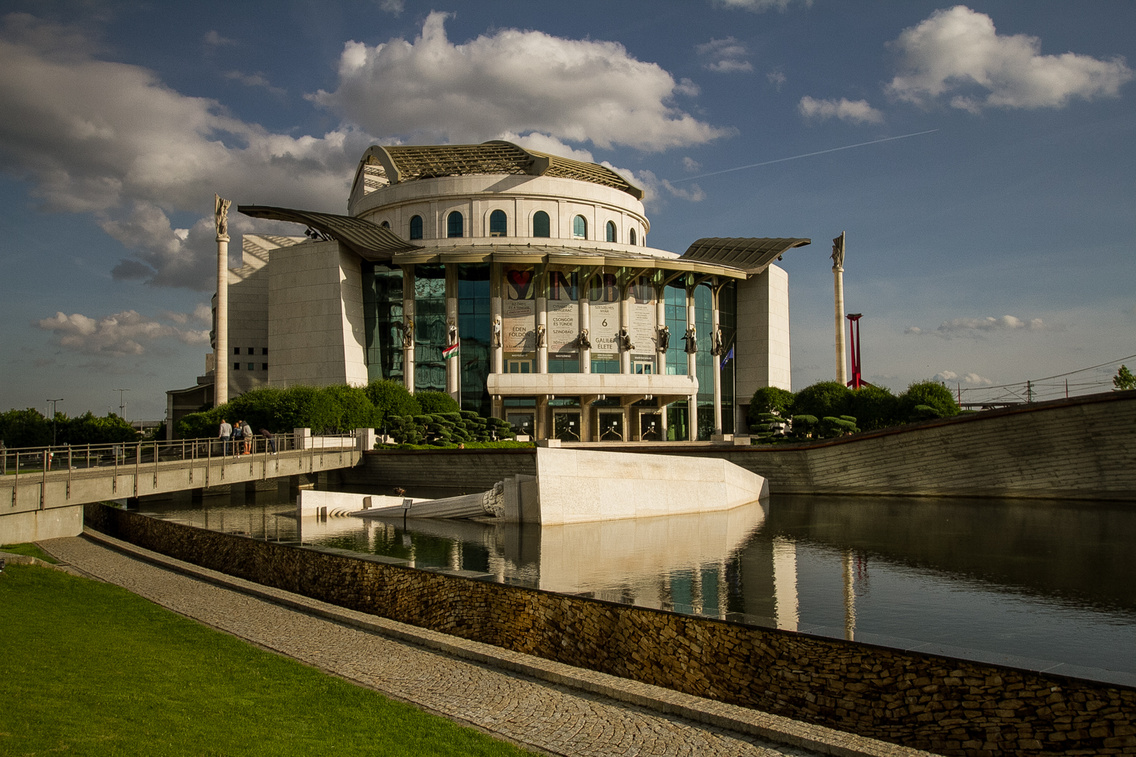
On paper, the National Theatre is the number one, or at least one of the most important theatres in the country, and the building that houses it should reflect that. But the National Theatre, designed by Mária Siklós and not without scandal, reminds us more of the world of the shopping centres than that of culture. It feels cheap and tacky, and this is even more striking if you compare it with the truly exquisite building next to it, the Palace of Arts.
Residential block on Dísz tér (Buda Castle)
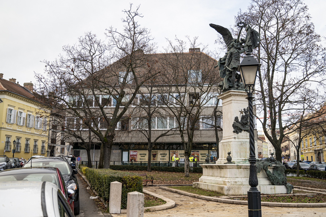
In the middle of the picture is that colourless thing someone once thought would be just right for the centre of Hungary's most important old town. Unfortunately, it is not the only 'modern' building to be wedged between the beautiful and well-preserved old houses of the Buda Castle District, making a mockery of them. But it is perhaps symbolic because of its central location on Dísz tér, at the junction of Úri utca and Tárnok utca. God knows who thought it would be a good idea to erect this building on Dísz tér, but for that alone such people should be banned from urban planning for life.
MOL Tower
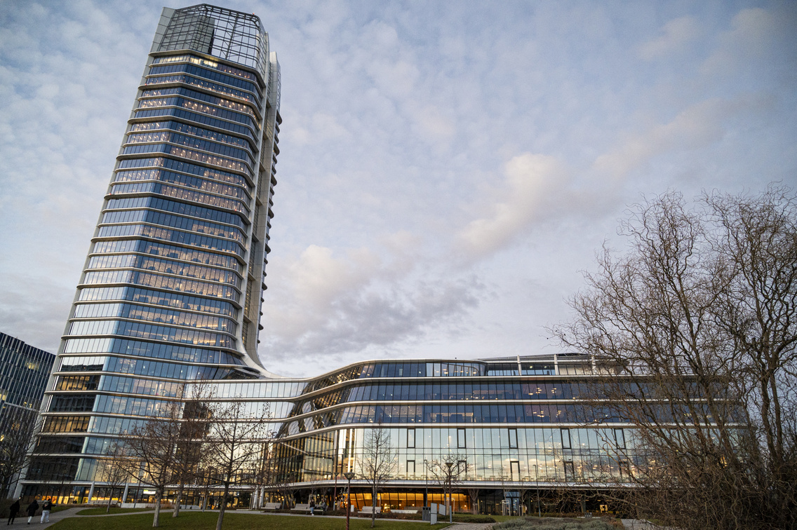
We'll leave the question of the form of the building for now, as well as the value of the MOL Campus in today's office building architecture. If we had seen the building on the drawing board, which was to be completed in 2022, rising up to the sky next to the Kopaszi Dam on the northern shore of Lágymányosi Bay, we probably would not have objected. It is attractive and ultra-modern. But the fact that it stands out in the cityscape, and that there is almost nowhere in the city where it does not spoil the view of Budapest and draw the eye away from everything else, is nonsense. The MOL Campus is the product of a company's megalomania that casts a shadow over almost the entire city.
Lehel Market Hall
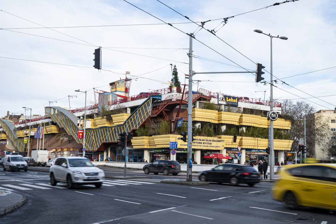
Budapest is full of beautiful market halls, even if they look very similar (because they were built around the same time). The Lehel Market Hall, built in the 13th district according to the plans of László Rajk and inaugurated in 2002, could not be further from the aesthetic. The building is a definite divisive issue for the people of the city, but those who defend it do not claim aesthetic reasons, but functional ones. And yes, the Lehel Hall is a very functional building, and its symbolism (the shape of the nave) is clear, but the use of colour and the gaudy exterior are annoyingly unattractive. It's a bit like a Transformer character gone wrong: when it was first proposed, it seemed like a perfectly good idea, but when it was finished, it turned out not to be quite so.
Office building on Szent István tér
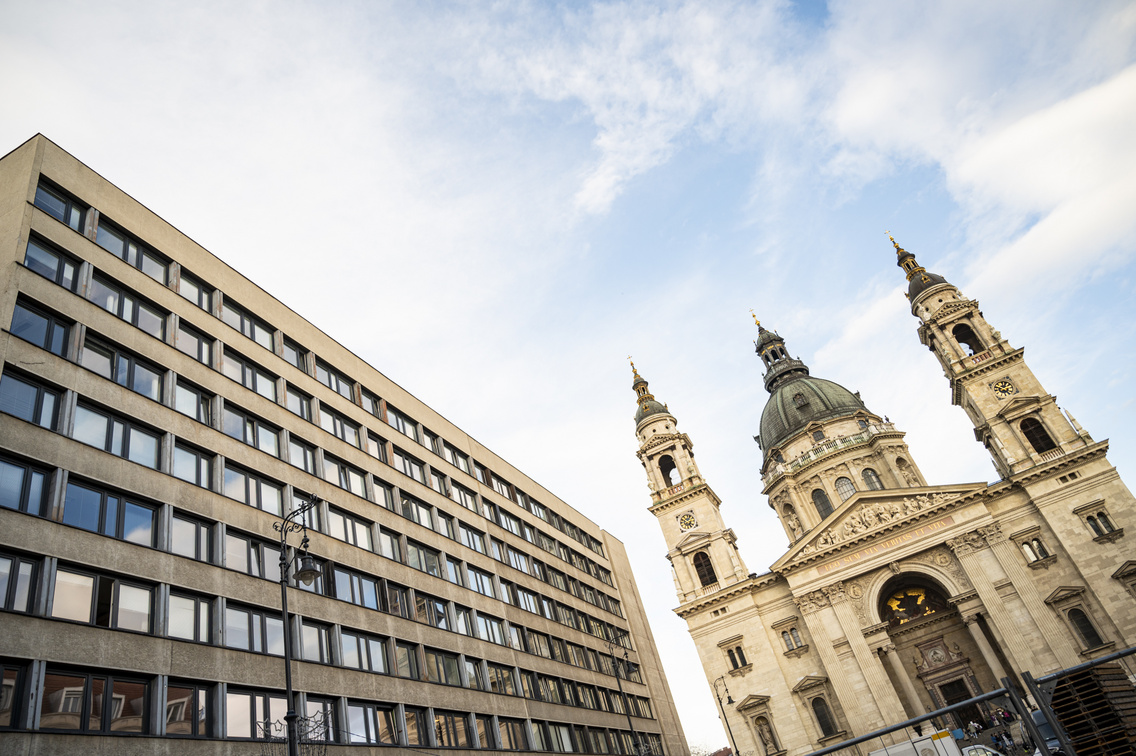
The situation here is a bit similar to the Castle District: you have one of the most beautiful buildings in Budapest, the Basilica, and next to it you have the ugliest office building in the capital. Of course, this may have been a concept so that the ugliness would accentuate the beauty, but we fear that this was not the intention. It was simply ignored. The Basilica is surrounded by otherwise attractive buildings, except for this one. It is quite like when you are resting with your eyes closed, completely relaxed, and someone shouts at you at point-blank range.
Nyugati tér overpass
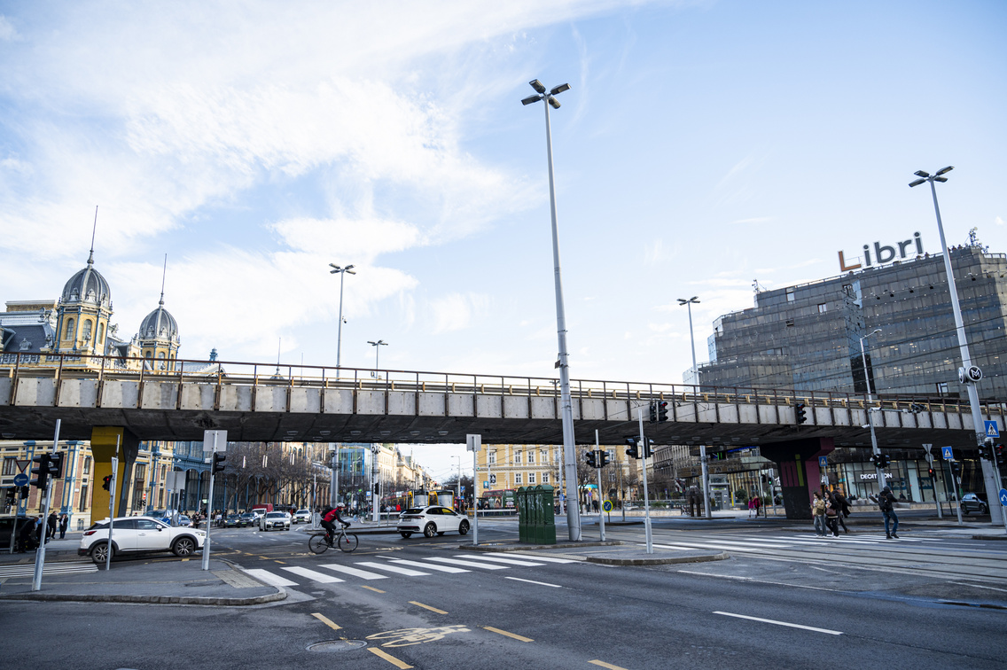
Nyugati tér was once one of the most atmospheric and beautiful squares in the city centre, and the reason why it is not today is partly due to the structure towering over it. Not only is it ugly now because the overpass practically cuts through it; it's a pity that it's there at all. We were delighted when it was proposed to be demolished, and disappointed when it wasn't. As with the Lehel Hall, we understand the function, but as a visual feature, it is hideous and bulky. We sincerely hope it will be demolished one day.
(Cover photo: Milán Medgyesi - We Love Budapest)


