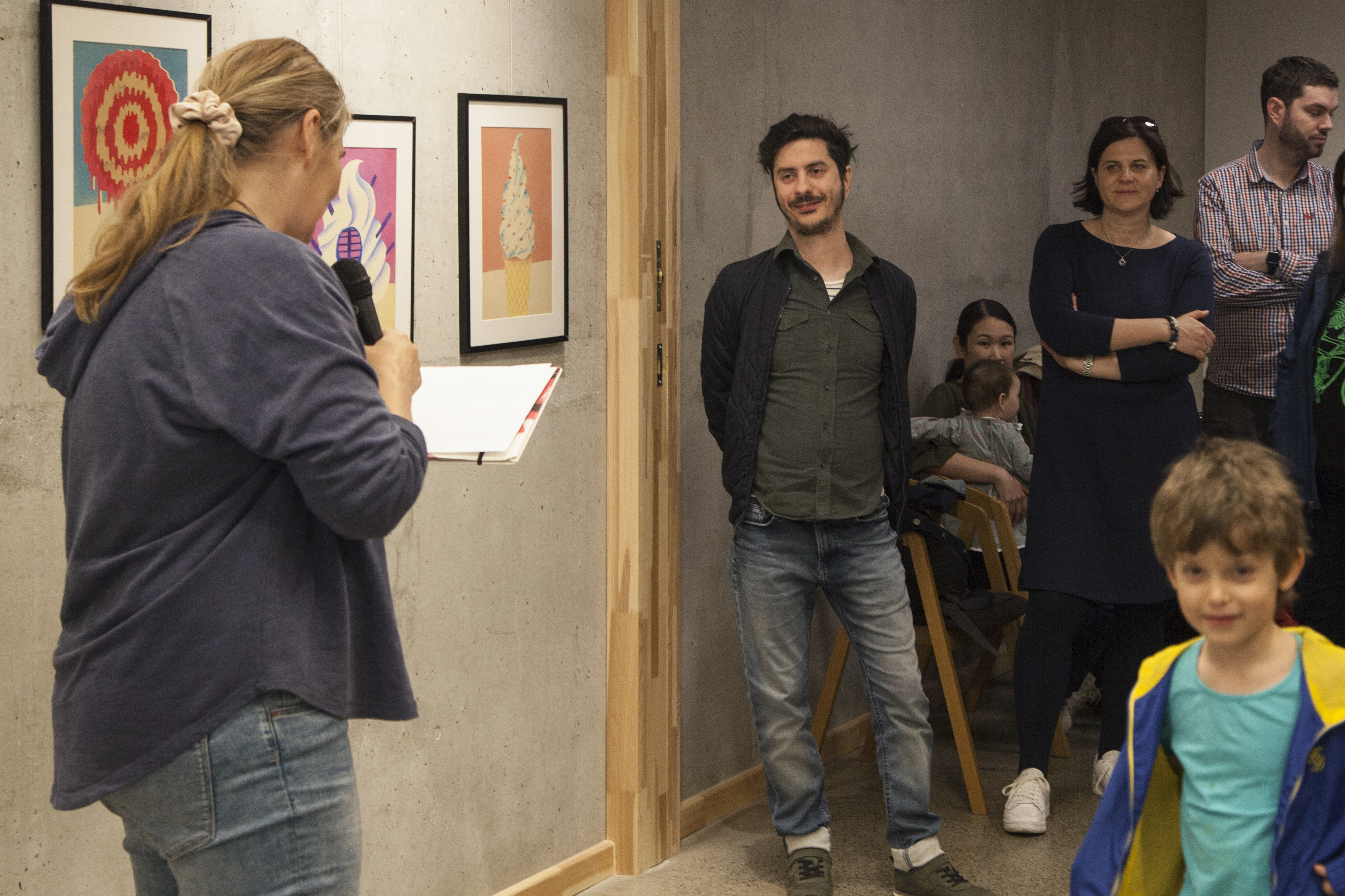
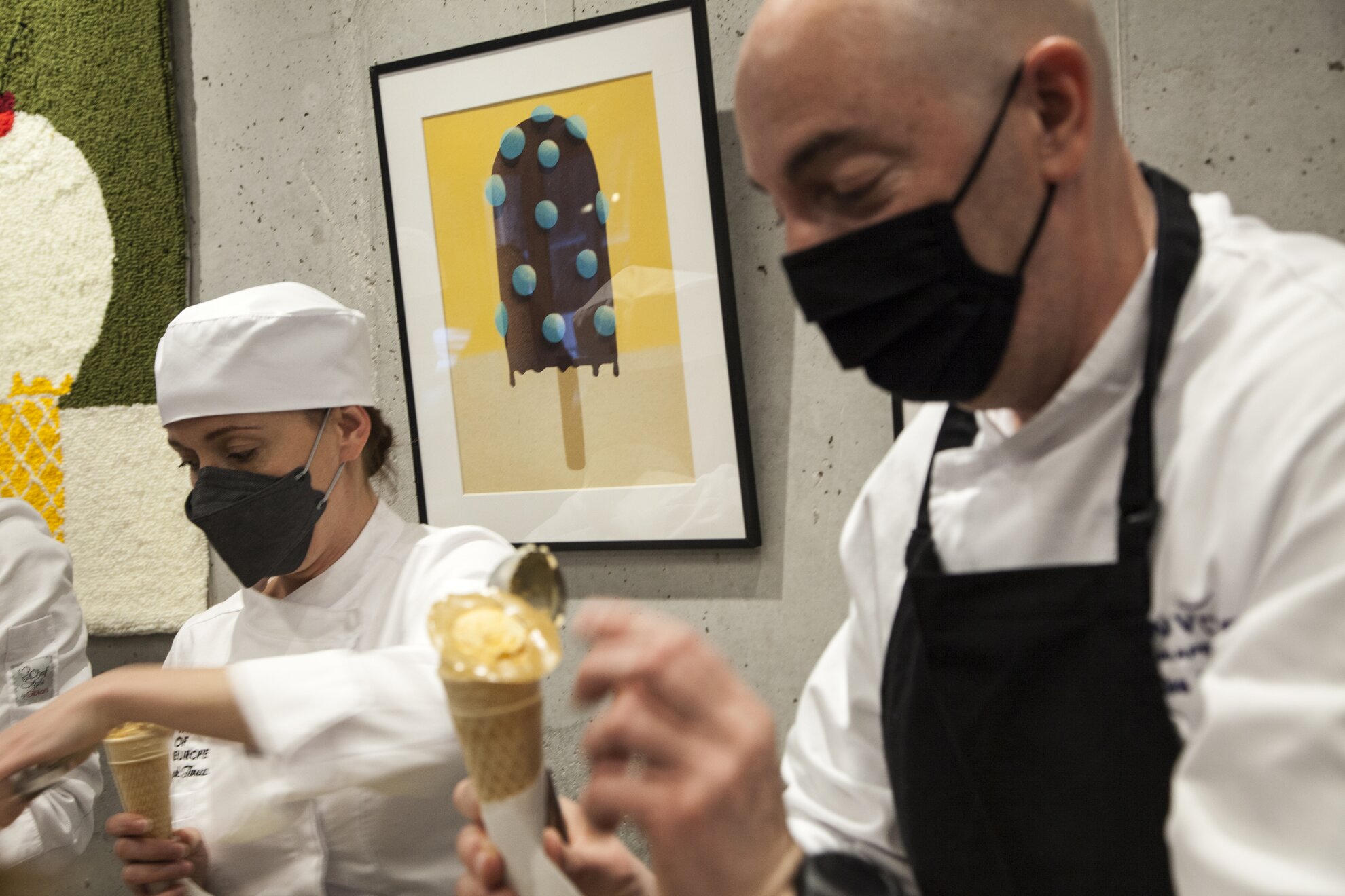
At the new
exhibition of the Culinary Institute of Europe, Anemoia – Nostalgia for
a time you’ve never known, you can see the works by acclaimed illustrator, Lehel
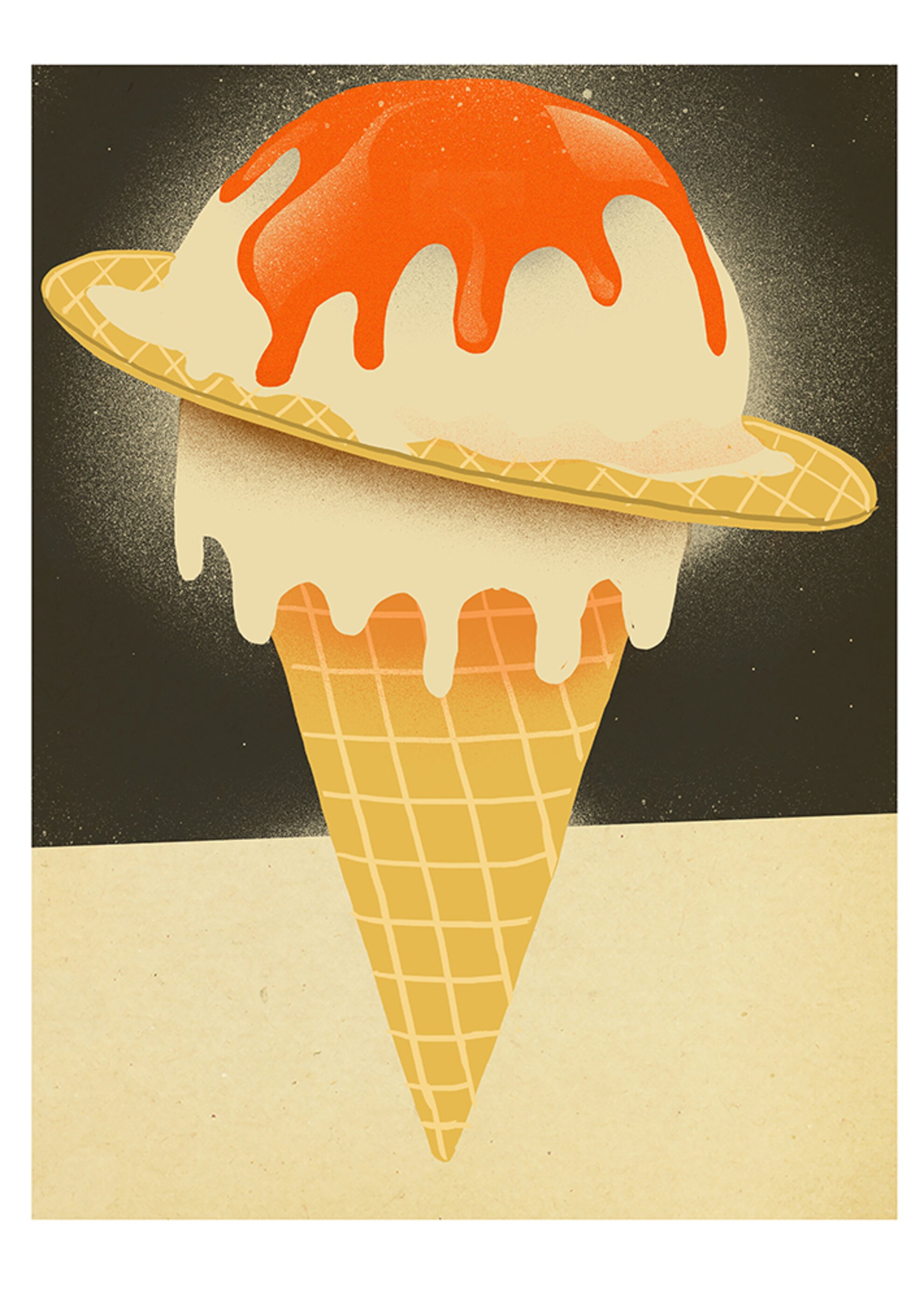
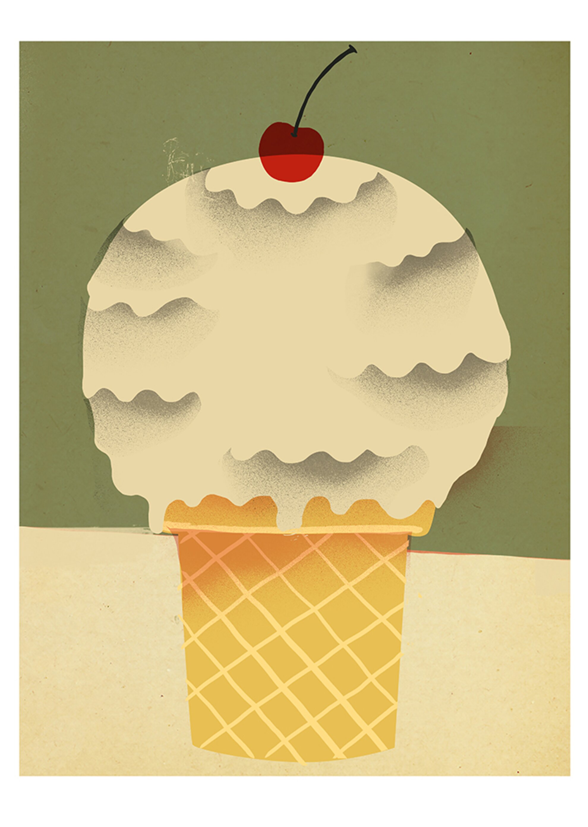
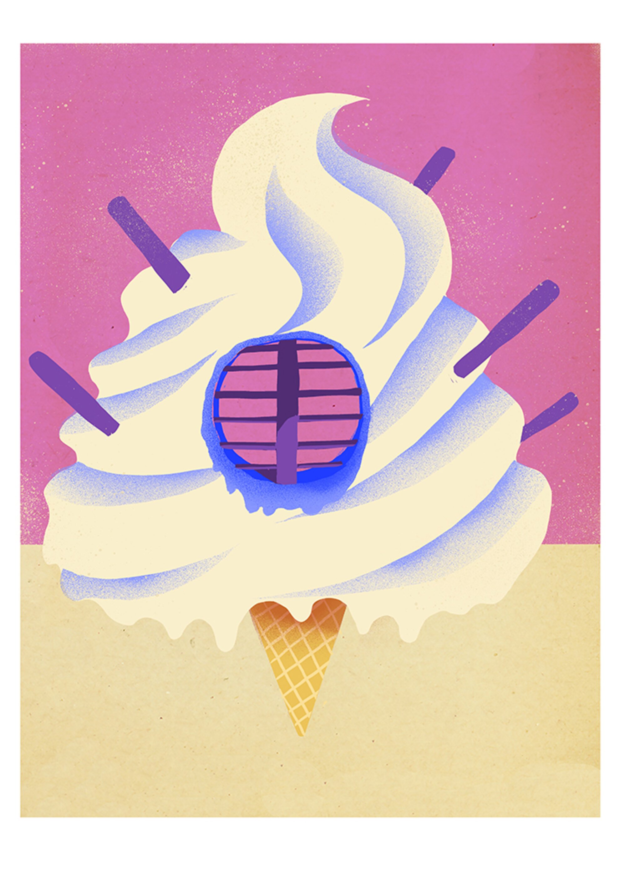
Kovács. The series focuses on summer happiness and feature mostly ice cream, with peculiar varieties such as the
space cream and the 100-scoop ice cream.
At the opening of the event, visitors were welcomed by special icy delicacies dreamed up by confectioner Krisztián Kiss. As we were walking through the
exhibition, the question arose: How does an illustrator get to work for the New Yorker? Luckily, the artist answers this and other questions about his Eastern-European approach, his famous magazine commissions and his ideal ice cream.
We Love Budapest: As far as I'm aware, you are not from Budapest – you were born in Transylvania but have lived here since you were 16. The capital seems to be important to you, but most of your customers come from abroad. What does Budapest mean to you, why did you decide to live here?
Lehel Kovács: I have been working as a freelancer for 15 or 16 years and 99 percent of my clients are foreigners – even my own friends wonder sometimes if I live in Berlin. Twenty years ago, you had to grab your pen and paper and leave Hungary if you wanted to have foreign customers.

Now you don't need to do that any more, you can easily work online. But at the same time a sort of Eastern-European approach is present in my work, and my childhood and memories greatly inspire me, whether I work for clients or for myself.
WLB: The terms 'fake retro' and 'child-pop-art' are usually associated with you in connection with your style. Is this related to this specific Eastern-European approach you mentioned?
LK: Budapest is my home, I live here. I have a particular ironic-nostalgic vision that I think is characteristic, a kind of bittersweet, satirical approach. The city and some of the situations I’ve been in have actually directed my interest towards this philosophy, it may seem exciting and different looking at this from abroad.
WLB: You’ve had typical projects related to life in Budapest. Sometimes you feature classic buildings in Eastern Europe, general architectural styles in the region or iconic Budapest locations as well. What else would you like to draw concerning Budapest?
LK: Yes, I had a joint project with BP Shop, where I made illustrations of locations
in the capital for T-shirts and other clothes. I also worked for the Budapest
Souvenir Poster Shop, I drew posters and postcards of the Basilica and
Margaret Island, and I also made illustrations for several Hungarian newspapers.
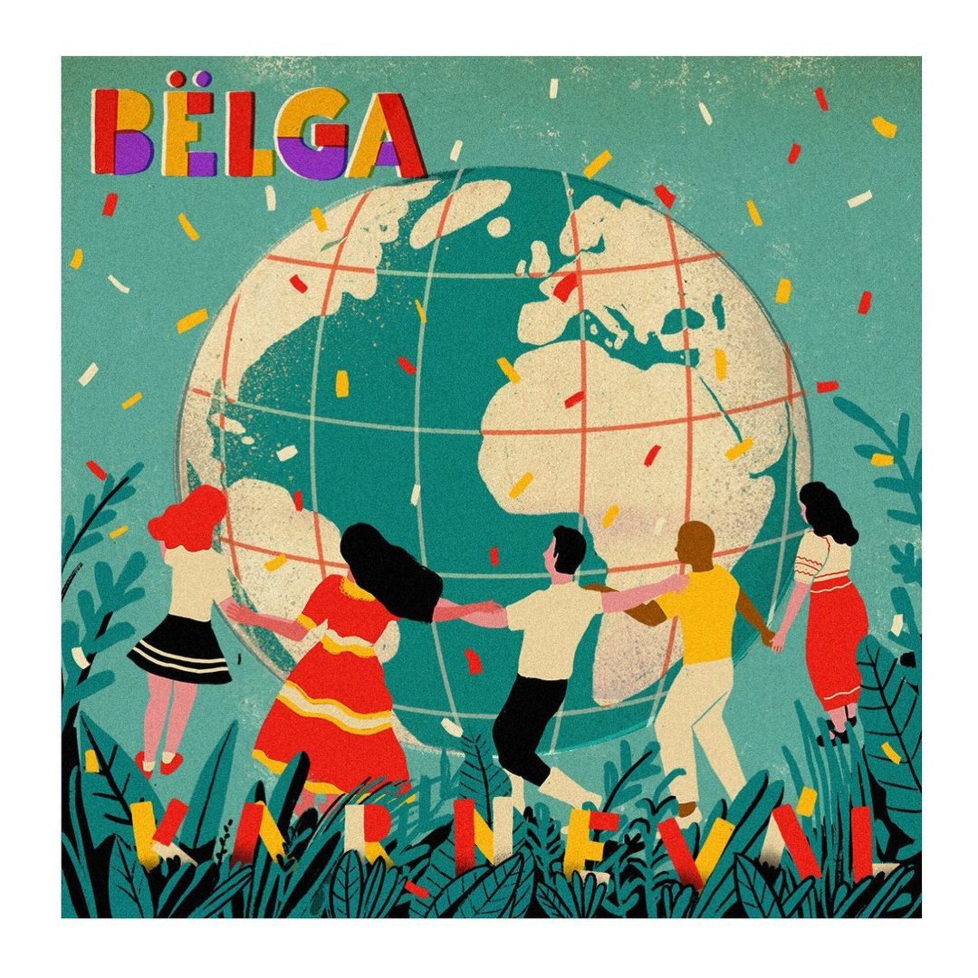
If you know the Hungarian alternative band, Bëlga, I designed their latest
album cover.
For one of the works I did for the poster shop, I replaced the
cross of the Basilica with a completely universal symbol, a heart. It would be
interesting to have a series where you could substitute similar, general icons with slightly different ones. For example, in the '80s, the Communist red star
could still be seen on swimming pools and public buildings in many places, and
it may be interesting to deal with this symbol from this point of view. I had a
couple of pictures made according to this philosophy, but I didn’t continue the
series after that.
WLB: You mentioned your own projects and those you made for larger clients. How does your own style work when you work for larger clients?
LK: 90 percent of my work is commissioned, in which case I usually have an art director who I have to work with directly. They often guide me in a direction I am not sure I would follow, but I obviously have to bring my own voice to the task. Obviously, a project of your own can also be good because there are no such constraints.
WLB: Is this type of freedom more intimidating or inspiring?
LK: The
projects are variable. Obviously people only see the work that I already
consider acceptable. It varies depending on how I work with each client, and
how much say they have in my work. At the same time, you have to know that my
original profession was a window dresser before I worked as a graphic designer.
I got tired of people having their say in my work, constantly wanting to tell
me what to do.
Although we are still talking about an applied genre, illustration
is also an escape from that situation. Clients give me a lot more freedom
because they see that I have a style that I work in, and in the best cases, they
let it unfold. It doesn’t happen that often that they back me into such a corner
that they’re just waiting for everything to be done.
WLB: You work with a lot of exciting customers, including the biggest ones. The New York Times, the New Yorker, Rolling Stone, the Guardian and the Los Angeles Times have already commissioned illustrations from you. How do you manage to reach them?
LK: This
was actually the biggest stroke of luck in my career. Here in Hungary, illustrators
mainly work in books and, as this wasn’t my primary goal, I started looking and
thinking about how to get to the top magazines. The first port of call was illustrator
agencies abroad. They work much like modelling agencies, the illustrators have
a portfolio. I sent some of my work to an agency in Berlin. They started in
2006, I started in 2007 and I just fit in with their idea, they wrote it back,
it came together.
I was shocked because they were already working with the
world’s top illustrators back then. I never dared to ask them how they selected
me, but essentially the collaboration has been going on ever since. They are
represented in certain areas, mainly in Germany, Austria and Switzerland. As a
novice illustrator, it is a great help to have an agency that handles
everything from invoicing through to contracts.
WLB: How can they help you besides the technical aspect?
LK: The German market, for example, is much harder to get to know from here than, say, the American one, because there are also small publications, magazines, publishers that are hard to find online. In contrast, say, an American magazine can be found anywhere, along with their contact information.
WLB: You mentioned that you’ve also been working as a graphic designer for a long time. Many people do not know the difference between the two professions, graphic designer and illustrator. How would you put it?
LK: The two concepts are really very confusing here in Hungary. I’ve been struggling for ten years to be an illustrator, not a graphic designer. However, there is not such a huge difference. I define a graphic designer as working in a certain genre, unlike the visual artist, and the illustrator is somewhere in between. It depends on your individuality, which one you are closer to, and how much you can create your own voice and at the same time adapt to the needs of the client.
WLB: You can see your own project at the show. Why ice cream?
LK:
Because I come from the world of advertising as a window dresser and a graphic designer,
most of my work is loud and eye-catching. There is a kind of expression that
you have to be a image-smart. In essence, these ice cream pictures are also formal
experiments in this. My goal was for those who look at them to be captured by
happiness. I wanted a broad concept and thoughts that weren’t too overreaching
since I’m not an artist.
There are also a lot of playful associations in there,
my pictures look like ice cream, but if you take a closer look, it’s clear that
no such ice cream exists. This kind of duality is also characteristic of the technique, we see prints that in many cases look like screen printing.
Basically, this is very typical of my style, it seems realistic, but on closer
inspection you notice the small differences.
Event information
The exhibition can be visited in person by appointment (+36 30 570 0696) and all the images can be viewed and purchased at eatartcollection.com.

Megjelent első bookazine-unk, ne maradj le róla!
Már 15 éve lélegzünk összhangban a fővárossal. Jubileumi kiadványunkban mindent megtalálsz, ami magazinunk és eddigi munkánk esszenciája. Gasztronómia, kultúra, városi legendák és Budapest arcai, interjúk, történetek és a legjobb helyek – úgy, ahogyan mi látjuk a fővárost.
Rendeld meg itt vagy keresd a nagyobb könyvesboltokban!
hirdetés