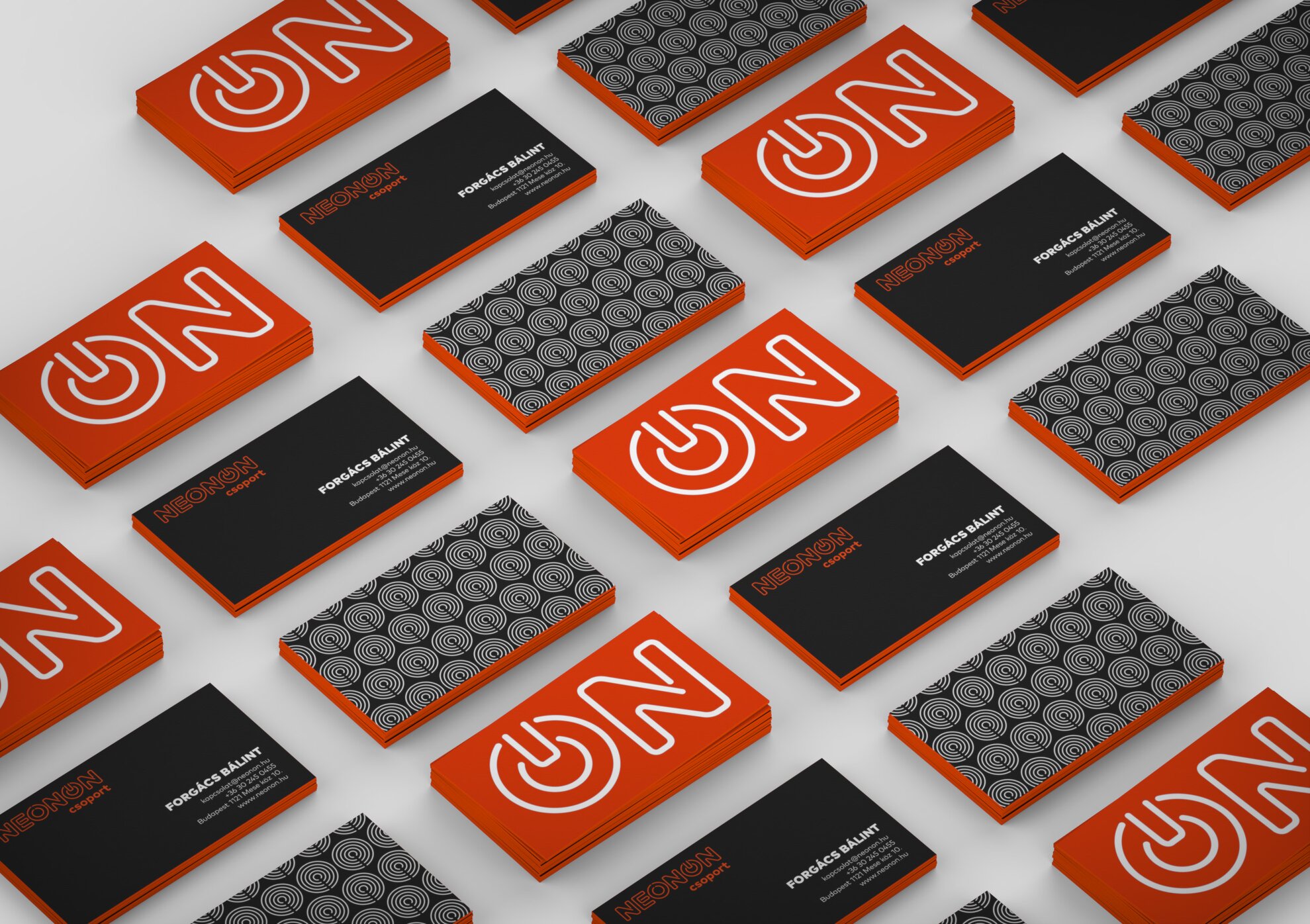
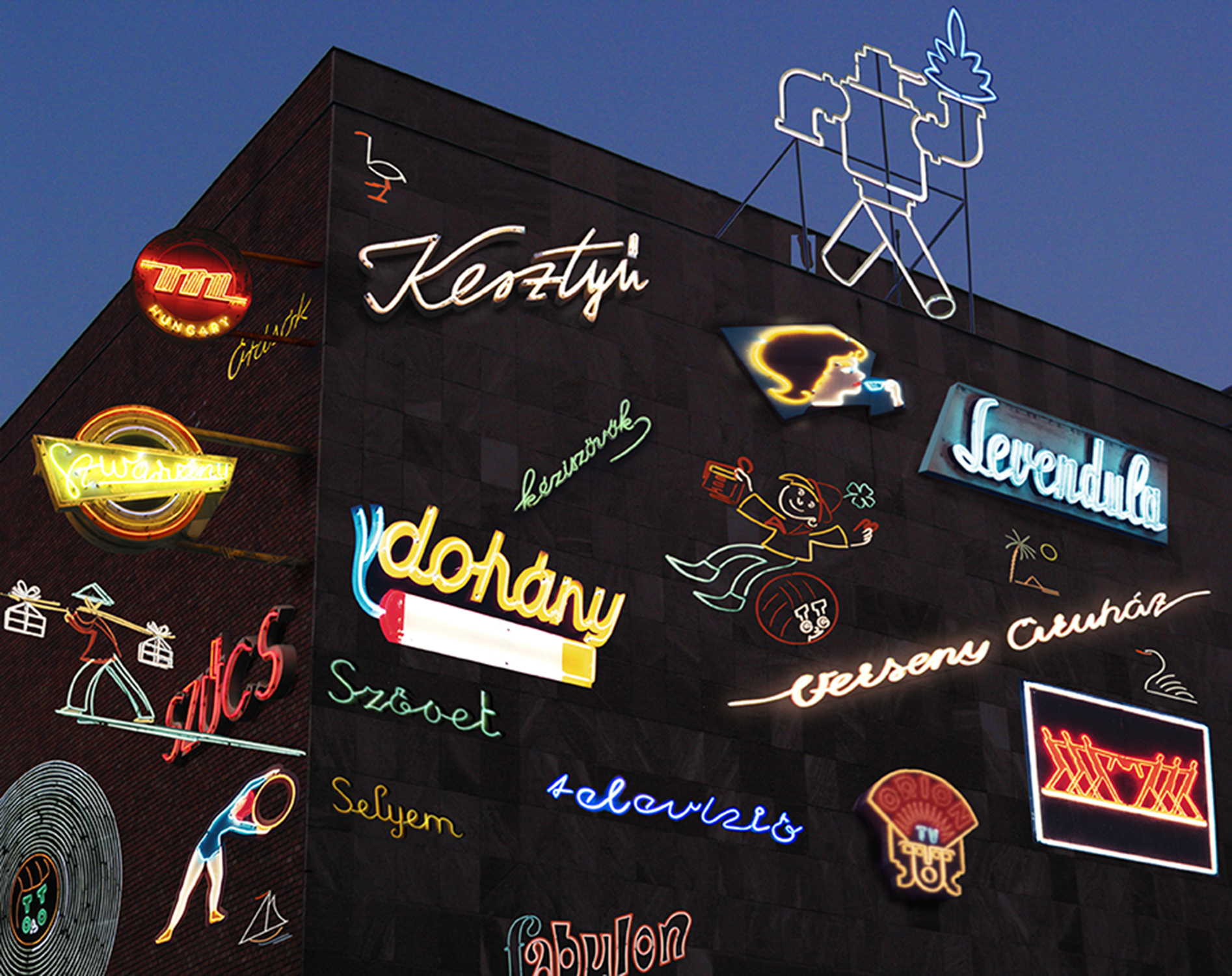
Young Hungarian graphic designer Luca Patkós stumbled across the Neonon group by chance, and their efforts influenced her so much that she focused her diploma project on the organization, deciding to design the group’s image and rethink their activity so far.
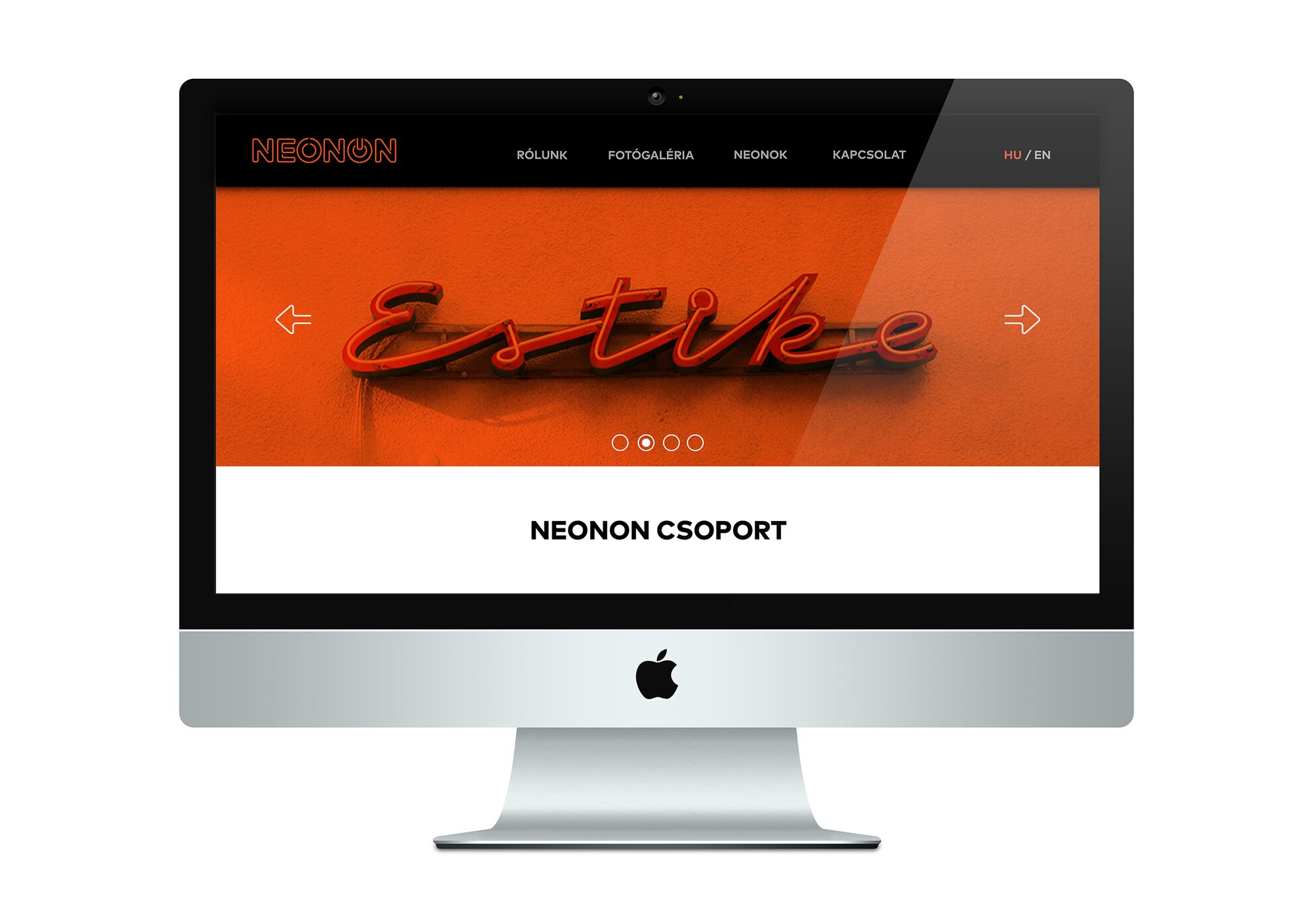
The project can be divided into two parts: one includes the group’s logo, business cards, a Facebook page, infographics, illustrations, flyers, and a website; meanwhile, the other part is the identity of the planned museum, including pictograms, tickets, and brochure designs.
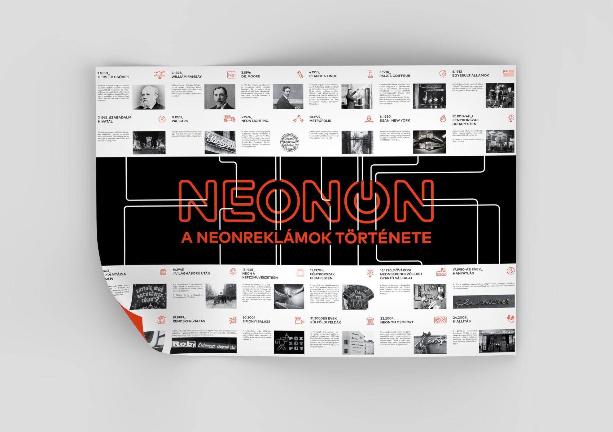
Each element of the project was designed to restore the atmosphere of the city’s classic neon signs while modernizing the phenomenon. For example, the logo is simple, clean, comprehensible, and can be used on many surfaces, and the “on” button reflects on the ending of “Neonon”. Naturally, Luca’s choice of color was deliberate, as well: her research revealed that neon gas is essentially red when charged with electricity, and that all other colors in neon signs are created with color powder.
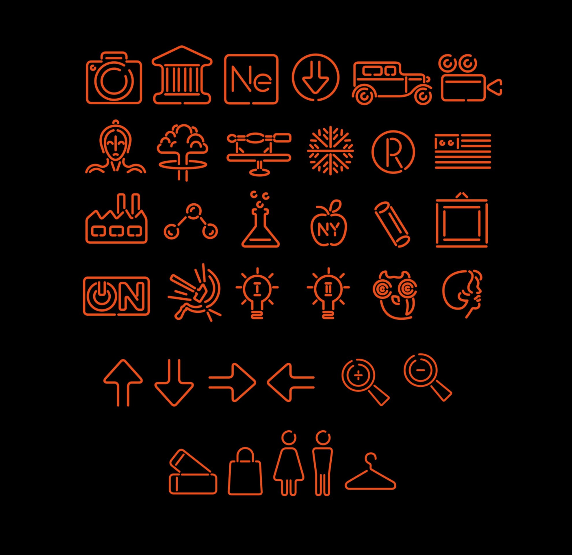
A similarly deliberate concept is behind the rest of the project: for example, the pictograms were made primarily for the infographics that present the history of neon signs, and can be bent from actual neon tubes. These turned out so well that they could even serve as tattoo templates.
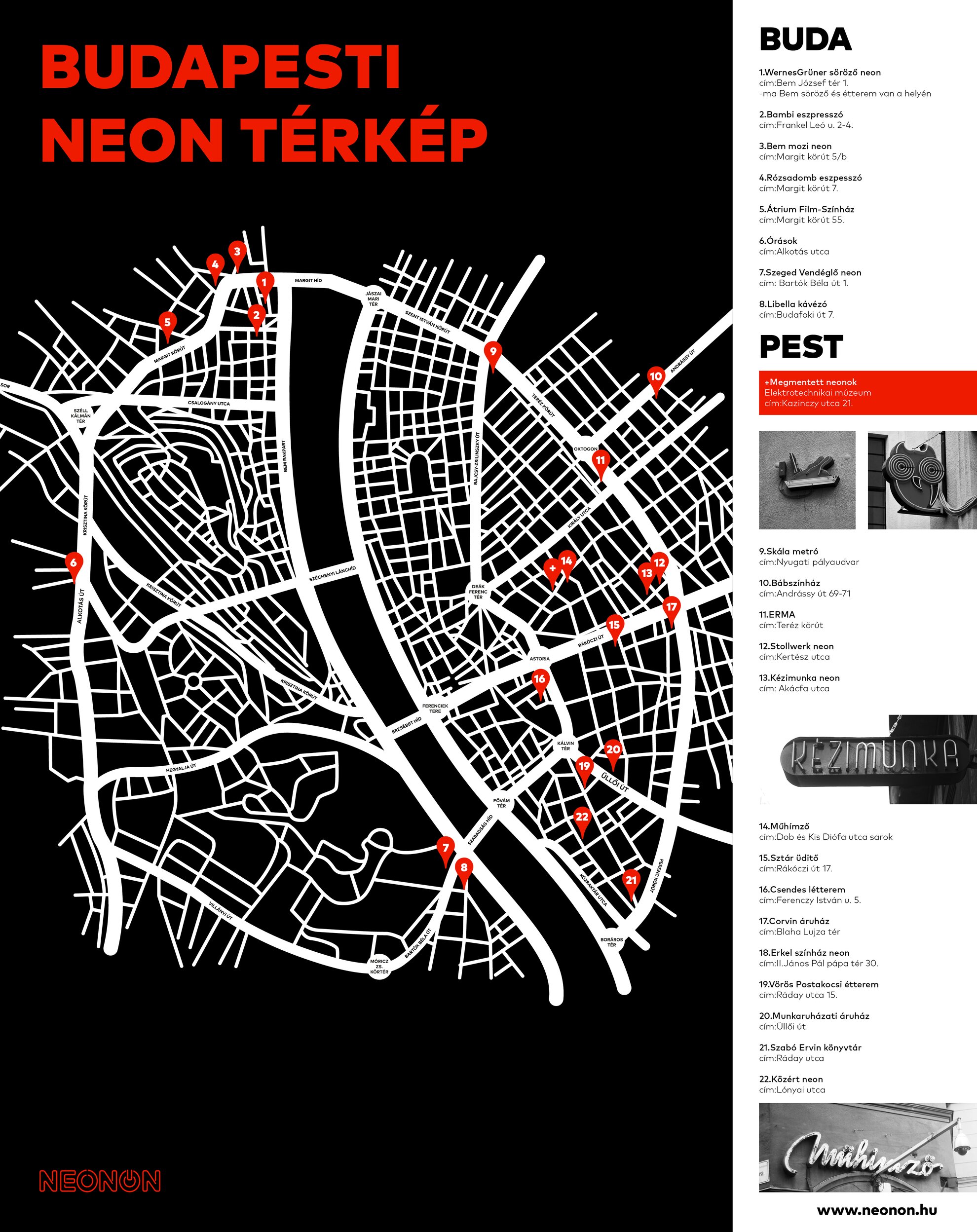
Another aspect of the project that piqued our interest is the neon map of Budapest, which shows us where to find illuminated signs in the city – and the best part is that the map itself looks as if it was made from neon, as well.
The museum part of the project – which is basically planned as an electrified wall showcasing all of the renovated signs – still has a long way to go, but we hope that this idea will eventually be realized, too.
